
An interesting read
For next level design inspiration, insights, advice and #TeamLaunch news, check out the articles written by the team below.

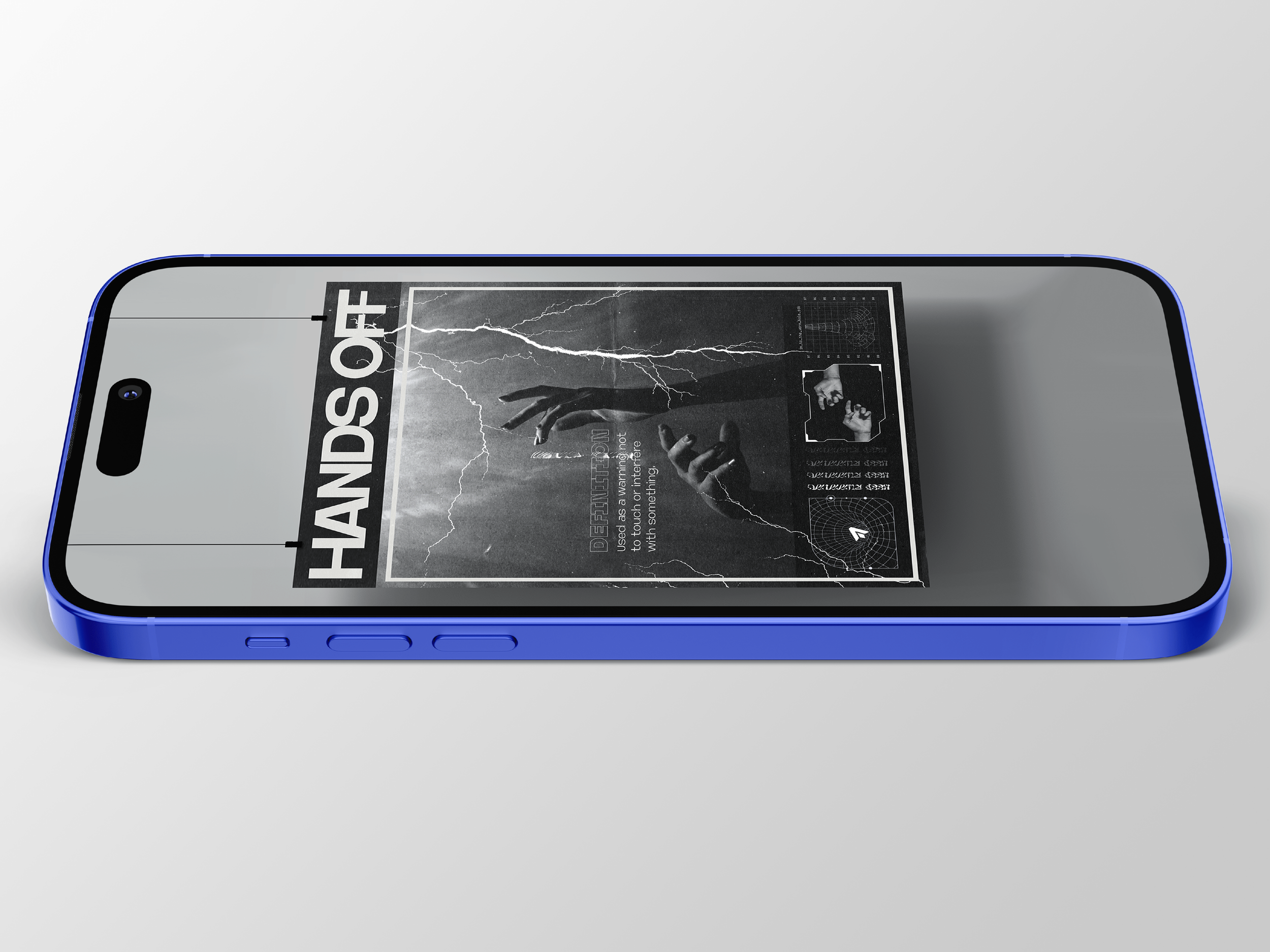
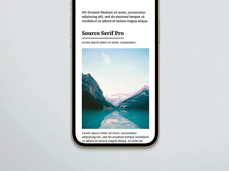
Designing for Instagram
In this short blog Giles explores the relatively unspoken discussion of designing for Instagram outside of client work. Considering themes of whether there is a criteria, why is it unspoken of and some of the pros and cons…

A refreshing rebrand – when, why and how?
After 60 years of their signature palette, Strongbow have announced a rebrand, with their new colourful can designs. Rebranding is a natural part of any company’s journey, but how do you know when the right time is?
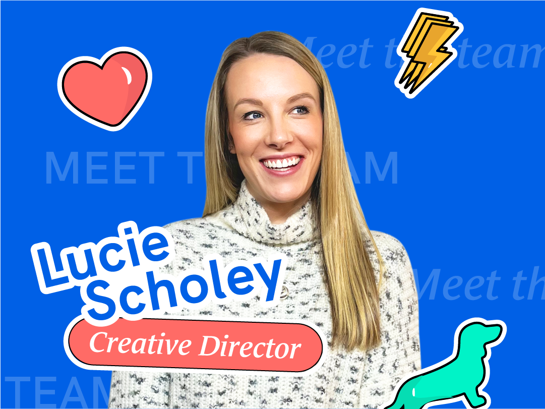
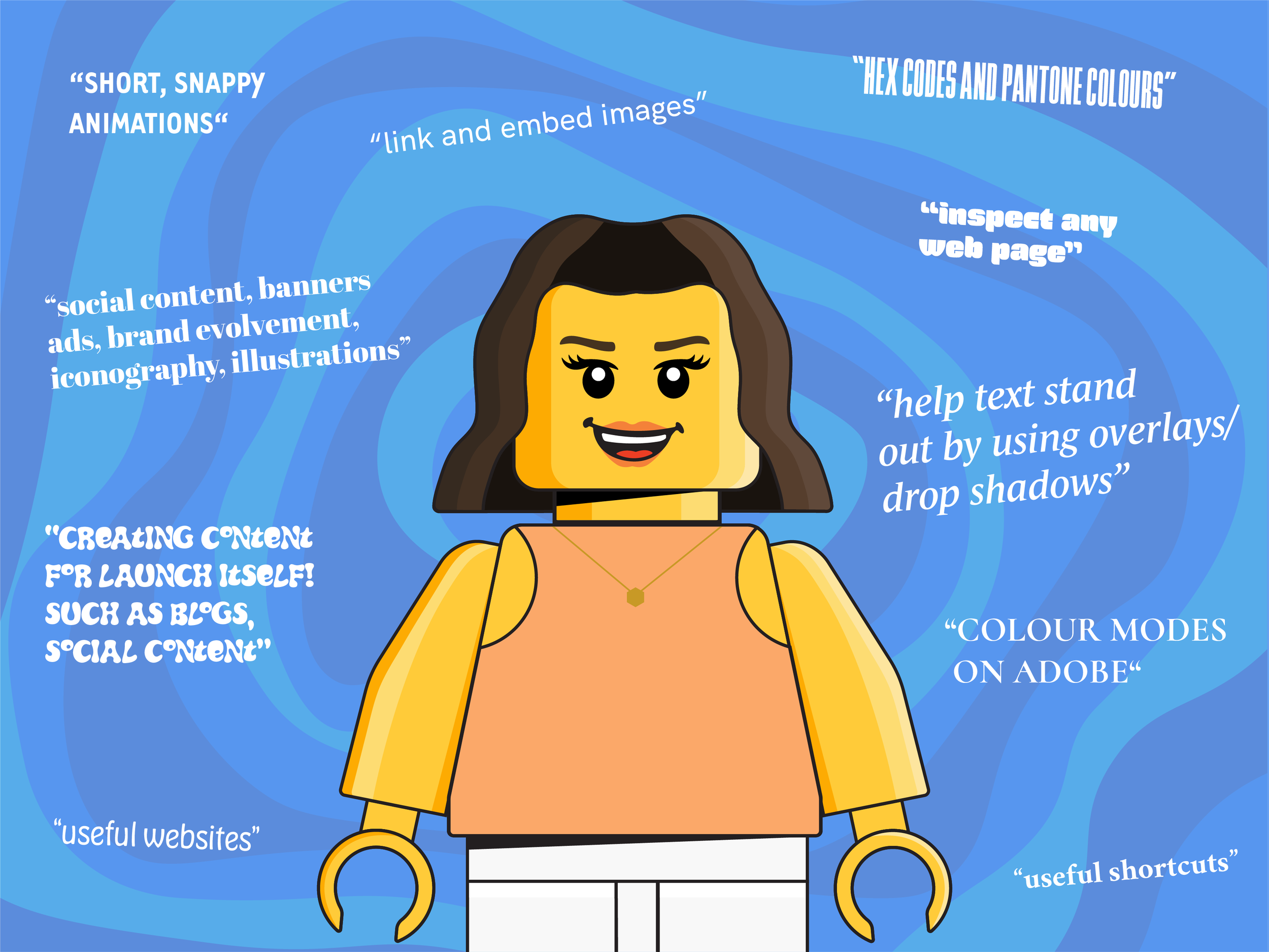
Meet the team: Lucie
Get to know the people behind #TeamLaunch – from our favourite projects to time away from the screen, and everything in between. Talented, up for a laugh and super passionate about all things design…

AI and ChatGPT's impact on graphic design
Artificial intelligence (AI) is transforming the way we interact with the world. One industry that is being revolutionised by AI is graphic design. In recent years, AI has become an essential tool…

International Women’s Day 2023 — Women in design
According to an article in Forbes magazine, 70% of design students in the UK were female, but strangely, when it comes to the workplace, creative industries are still a heavily male-dominated space (78%). Why is this?

Why is Motion Design important?
Simply put motion design is animation, this encompasses a massive field of work but here we are going to focus on motion design within the context of graphic design…
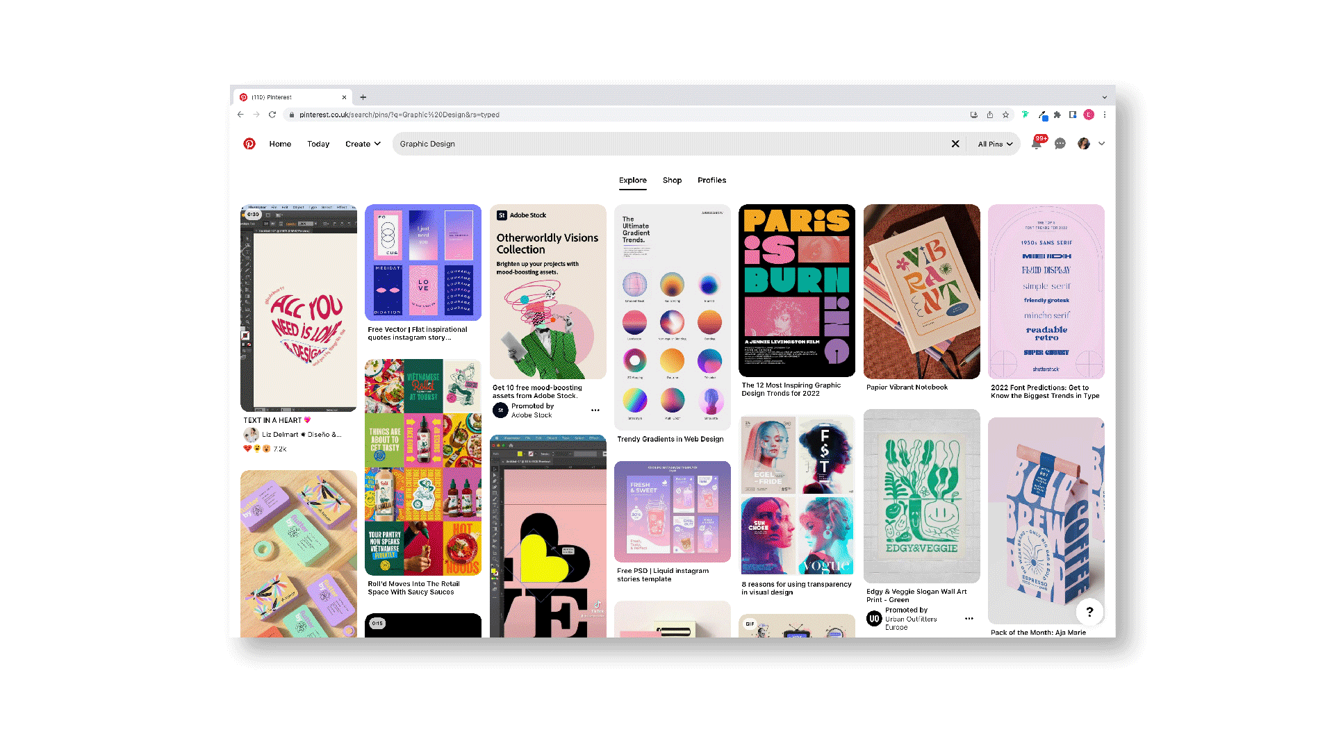
My top picks for Graphic Design inspiration
Whether you are starting a new project or want to keep up with current design trends then look no further — I have created my top picks, from web to print, and everything in between.
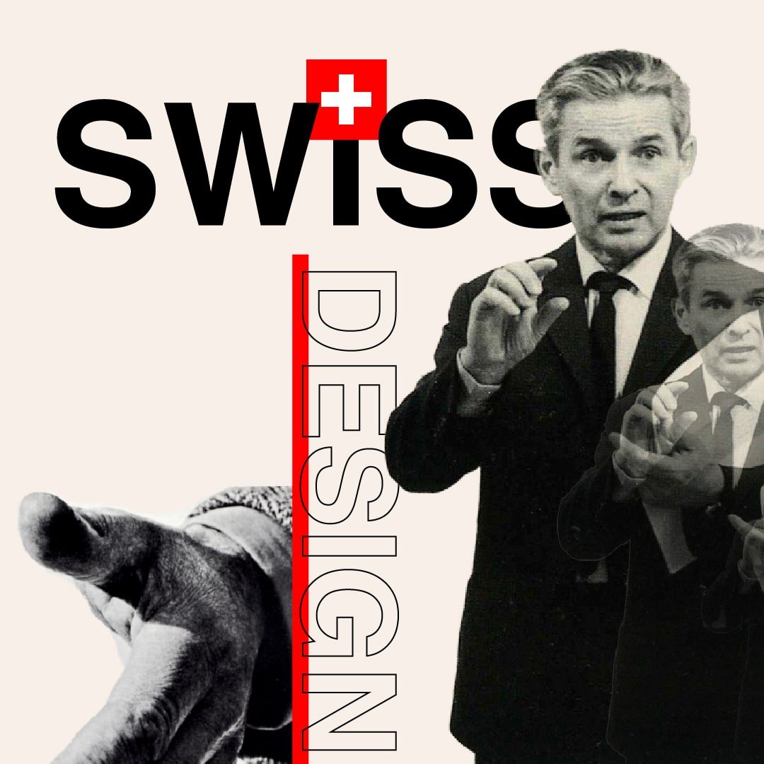
A whistle-stop tour: Swiss Graphic Design and its role within web design
Otherwise known as the International Typographic Style or Swiss Style, Swiss Graphic Design is typified by its minimalistic and asymmetric typographic composition, dating back to 1908. The consensus of Swiss Style is to present information in the clearest way possible, often utilising print-based mediums such as posters, leaflets and magazines. However, with the expansion of technology it has now evolved and become a popular design aesthetic adopted by designers today

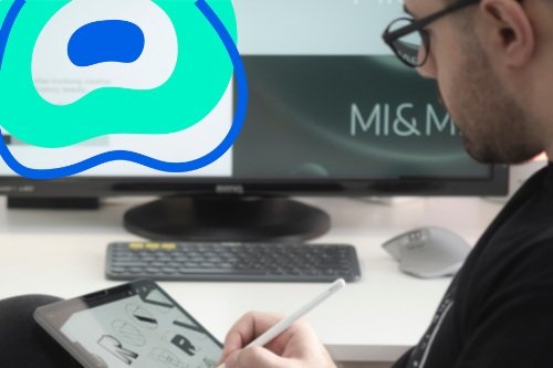
What does working with Launch look like?
So, how do we work with our clients, and build such great, long-lasting relationships? What can you expect from working with us? Look no further…

Is ‘The dispute between Max Bill and Jan Tschichold of 1946’ relevant to graphic designers today?
Jan Tschichold and Max Bill are arguably two of the most influential graphic designers of the 20th century, having a considerable role within the expansion of modernist design principles. In this blog we explore the relevance of their views in our roles today as designers.
A Reflection as an Intern
This blog is all about life as an intern for Launch Studio. Throughout the blog I talk about my role as an intern and share some useful tips that I’ve learnt so far which might be valuable to you too, read more to find out!
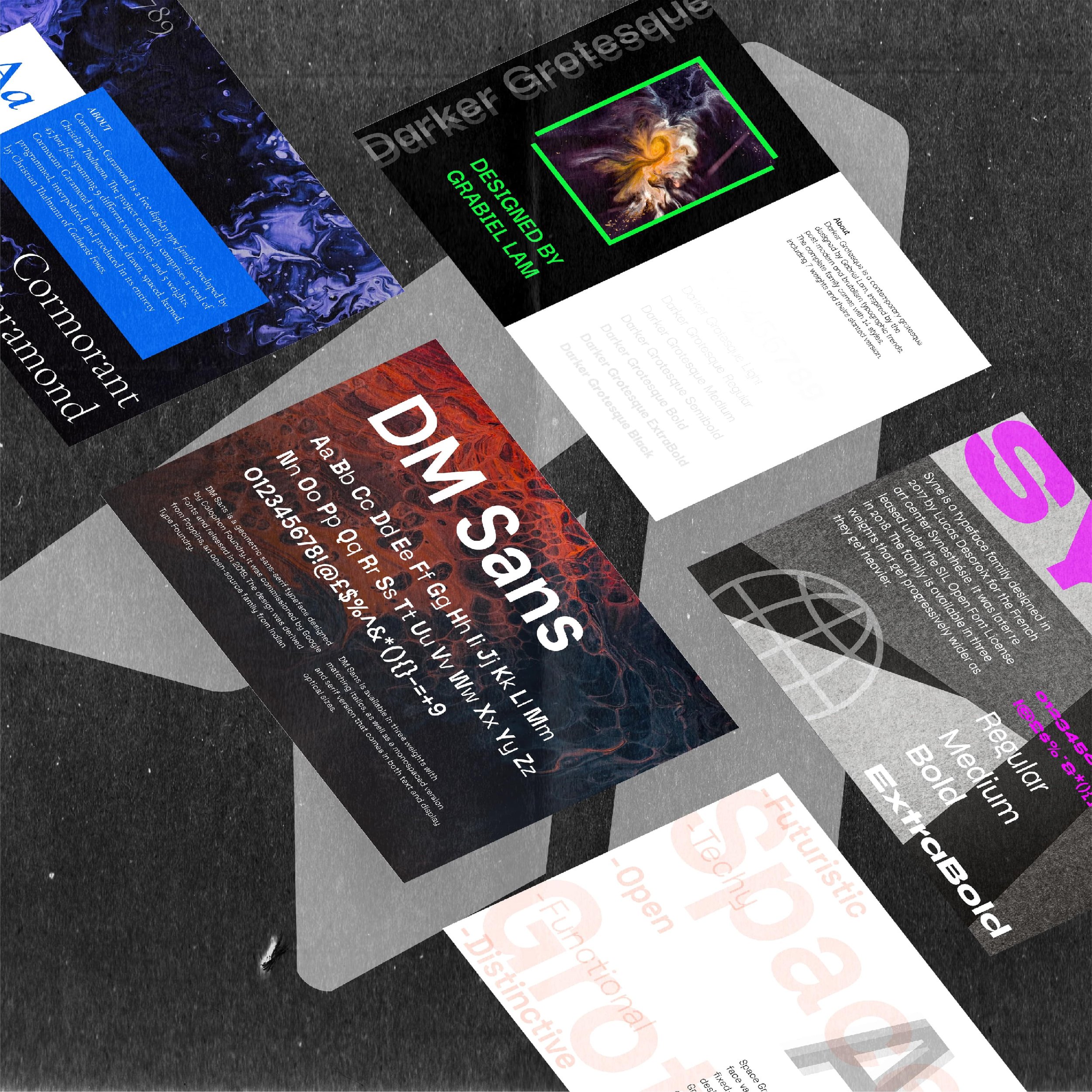
My 5 favourite Google Fonts
Google Fonts is an incredible asset for graphic designers, with a plethora of amazing free typefaces to use. Here are my favourite that have been sourced from here.
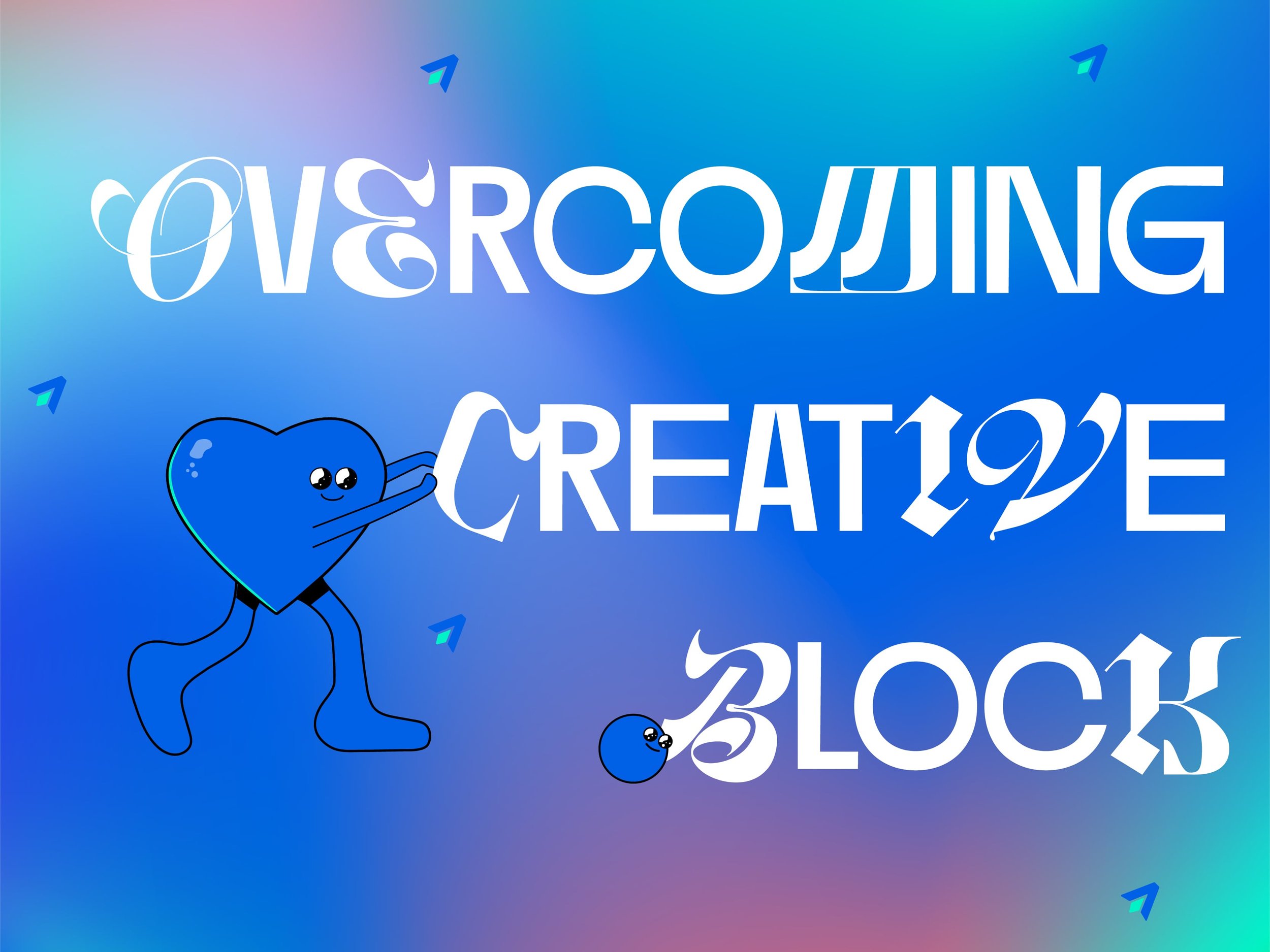
Overcoming Creative block – 3 ways to help you push past the wall
Creative block can be hard to overcome, especially when you want to and know you capable of designing. However, it happens to the best of us. In this blog we offer three tips on what we find useful to overcome this.
Canva’s role as a design tool
What do professional graphic designers think of Canva? We let you know.
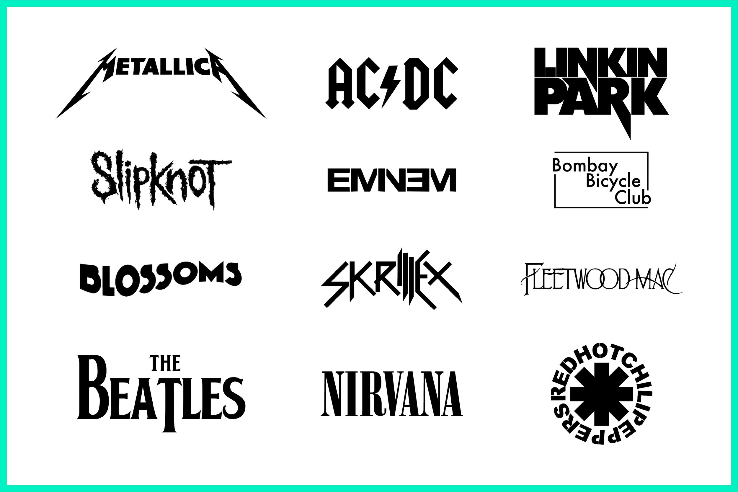
Typography’s relationship with music genres
The use of graphic techniques within the music industry and its promotion are inextricably linked — with the use of colour, shape, and in particular, typography shaping our perception of music genre. In this blog we explore typographic differentiation within album cover design.
Ways to make your portfolio standout to employers
When it comes to designing your portfolio there are many things you can do to elevate it and make it stand out from the crowd. In this article we have listed five steps that we think can help you create the best portfolio that reflects you and your work and catch the attention of a potential employer.
Typefaces and feelings
As discussed in our previous blog post tackling the topic of Comic-Sans, typefaces are designed for specific contexts and purposes. A type designer will take into account the size and medium in which a typeface will be used to inform the design process. There is another aspect that informs the design and choice of a particular typeface and this is its ‘feel’.
Comic Sans is misunderstood
As a designer you often get asked the same questions, one of those being ‘what do you think of Comic Sans?’. The general consensus, it seems, from non-designers is that Comic Sans is an inherently bad typeface. I would argue however that is not, it is just misused.
5 font pairings for 5 different projects
As graphic designers, the use of typography is fundamental in our practice. It can elevate our designs from simply art, serving both aesthetic but functional merit. In this blog we look at some of the recent font pairings we’ve enjoyed experimenting with.
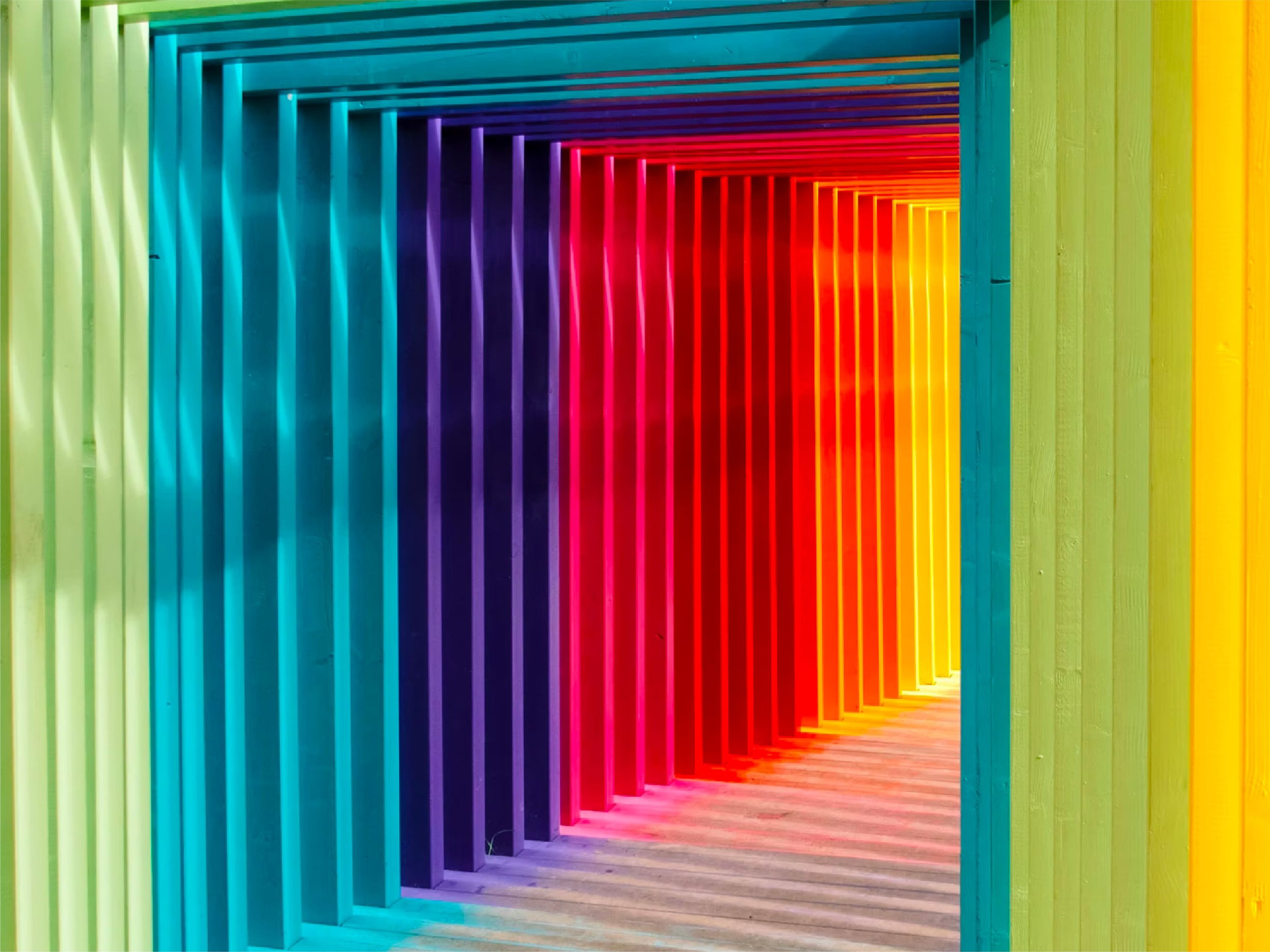
The psychology of colour
Did you know that colour increases brand recognition by up to 80%? It can be used to make a statement, draw attention, create engagement, set a mood… the list goes on. It can affect our behaviour, but, above all, it influences how we interact with a brand.