Hats off to M&S
When a brand disrupts the norm, empowers consumers, and delivers beautifully simple design, it doesn’t just turn heads — it earns loyalty.
It’s no secret we love a bit of M&S in the Launch office. And, just when we thought we couldn’t adore them any more, they drop a new cereal packaging design that’s smart, simple and really hits a new kind of mark.
We’re all for great design, but this isn’t just great – it’s clever, intentional and puts consumers at the heart of it all. Bravo, M&S!
The design
Let’s talk about that packaging. It’s bold and clean but, it’s not just about aesthetics, it’s about functionality. With a no-nonsense typography-led design putting the ingredient list front and centre.
Most cereal packaging relies on bright colours, mascots, and over-the-top visuals to grab attention, especially in a crowded supermarket aisle. M&S flips this thinking on its head with a minimalist design. Instead of shouting for attention, it stands out by being calm, confident, and ultra-clear in its messaging. This stripped-back style gives shoppers all the info they need, quickly and clearly. Proof that sometimes less really is more.
Despite the minimalist look, the range still has a strong shelf presence thanks to a clever use of a pastel colour palette. It’s a masterstroke, tying everything together beautifully on the shelves making sure these cereals sit alongside (and in line) with the M&S brand while still standing out in their own right.
Sure, typography takes longer to absorb than icons or images, but here’s the genius part. M&S wants you to pause and take it in. Why? Because each cereal has just six or fewer ingredients (with cornflakes taking the winning spot with just one!) That’s their USP, so why not put that fact on proud display. Less fluff, more substance.
The why
Consumers today are more clued-up than ever. We care about what we’re eating, we’re scanning labels and we’re done with ultra-processed junk. With this growing demand for transparency, M&S are stepping into the spotlight with a bold move towards “clean label” design – and they’re playing to win.
By making the ingredient list the star of the show, they’re saying: Hey, we see you. We know you care about what’s inside, and we’ve got nothing to hide. It’s a smart move in a market where so many brands have been called out for not-so-great ingredients. M&S are raising the bar and we’re hoping others take note.
So much more than clever cereal packaging…
M&S Food’s fun approach to packaging doesn’t just stop at cereal boxes. Their copywriting across various ranges really brings the ‘Britishness’ of the brand to life and injects personality where you might least expect it. And we’re loving it.
Just a few of our favourites:
“You’re a smart cookie” – Cookie packaging
“Ready to roll” & “You deserve butter” – Sliced bread
“Baking is our bread and butter” – French stick
“Doughnut if I do” – Jam doughnuts
“Love at first bite” – Fresh croutons
“You’re the sweetest thing” – Chocolate muffin
“Outrageously chocolatey” – Chocolate-covered biscuits (and they’re not wrong)
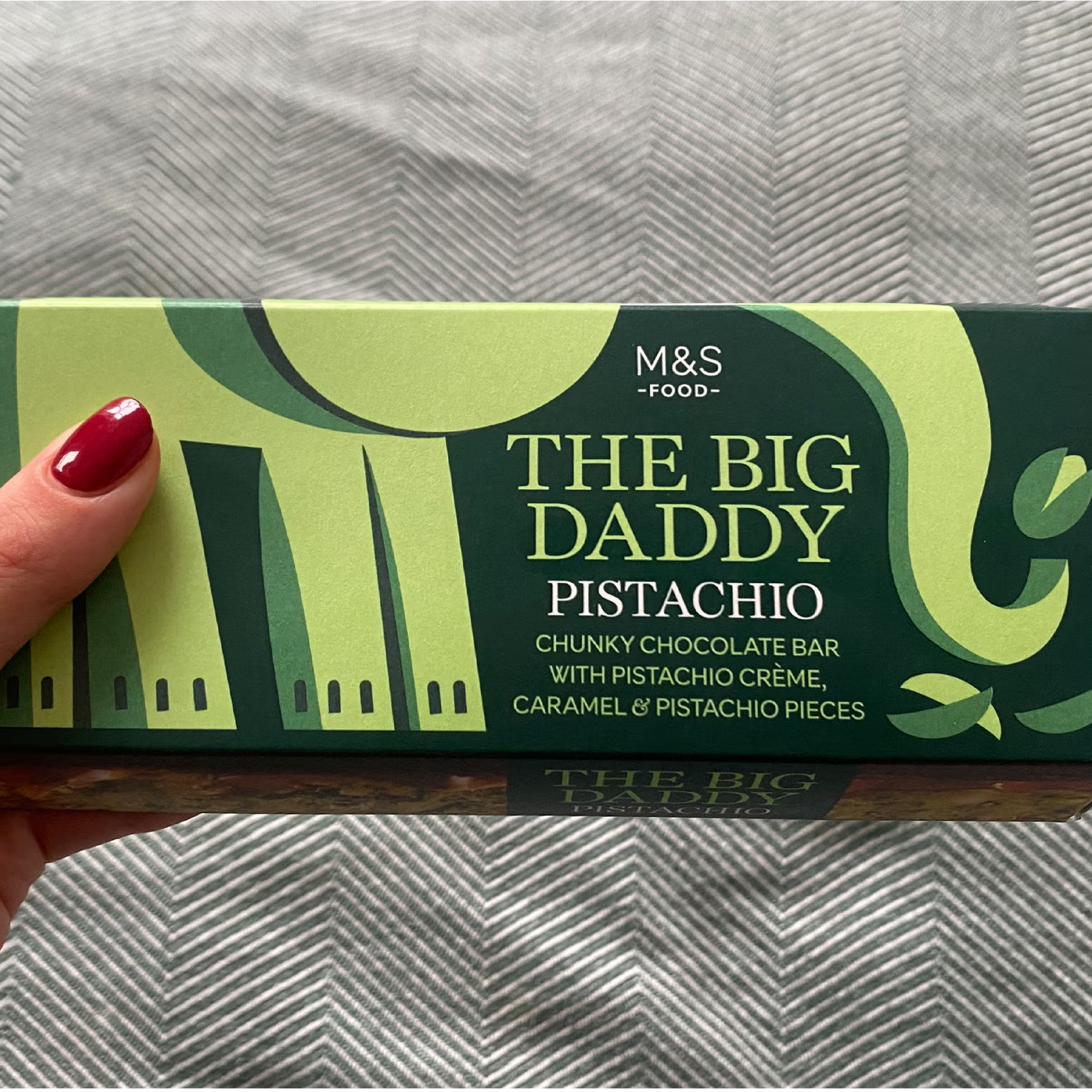
They lean into their brand even more when it comes to seasonal ranges. Colin becomes Count Colin for Halloween, Percy Pigs get spooky too, and Father’s Day 2024 saw chocolate bars hit the shelves with titles like “The Big Daddy” and “Whip off the old Block” – fun, cheeky and unmistakably M&S.
But it’s not just about the laughs and clever lines. Their 2025 Easter range, designed by illustrator Louise Lockhart, is a burst of joy; bright, colourful, and playful, it delivers exactly what you want from a seasonal treat.
Beyond food, they’re showing a commitment to sustainability too. They were the first food retailer to offer garlic bread in fully paper packaging that can be recycled, living up to their motto: “There is no plan B.”
Even their online sales packaging carries that same level of care and fun, delivering important messages with a sprinkle of M&S charm. That’s consistency. That’s branding done right.
Our two cents
This cereal range and M&S as a whole is a shining example of design with purpose. When form and function come together this seamlessly, that's when real brand magic happens. It's not just about looking good on the shelf; it's about creating meaningful connections, building trust, and showing consumers that you're listening.
From the stripped-back elegance of their cereal boxes to the cheeky charm of cookie wrappers, from joyful seasonal spins to forward-thinking sustainable swaps, M&S is showing us how it's done. They’ve mastered the art of brand consistency while still keeping things fresh, fun, and most importantly, authentic.
They’ve proven that subtlety can be powerful, and that clever, well-crafted copy and design can leave a lasting impression without shouting. And coming from an iconic British institution like M&S? There’s something really satisfying about seeing them lead the charge with such confidence and creativity.
Now excuse us, we’ve got a shopping basket to fill – cereal, cookies, and maybe a delicious Colin too!


