
The teams favourite album cover designs and why
Album cover design is a rich and exciting design discipline, incorporating everything from digital art, photography, typography to illustration and so much more. An album cover is a great way for a music artist to tell a story or grab their audiences attention. Working in a studio environment we are constantly playing music. We got chatting about our favourite album cover designs and what we love about them! Here's what the team came up with..
Lucie loves the iconic album cover for ‘Aladdin Sane’ - David Bowie because it breaks design rules and was controversial at the time (As well as being very expensive!). She loves the striking lightning bolt and has even got a print of it on her wall at home because she thinks it’s such a great piece of art!

David Bowie – Aladdin Sane

Pink Floyd – Dark Side of the Moon
Another iconic album cover favourite from Lucie.. ‘this one has been shared far and wide and repurposed across merchandise, posters, you name it’. This cover art is so iconic that it often appears without a name because the light spectrum imagery is so recognisable and impactful on its own.
Emily loves the polaroid-style of Taylor Swifts 1989 album cover. She thinks it perfectly reflects the time period of the album title and paired with the handwritten type, ‘helps to create a really personal, relatable and effortless feel, allowing her audience to feel a deeper connection; a window into her life’.

Taylor Swift -1989

Sanctuary - Gengahr
Ben chose this album cover for its intriguing composition of photography alongside the beautiful use of typography, he thinks it frames the whole image in a really satisfying way!
Ben also loves Kishi Bashi’s 151a for the hand drawn feel of the illustrations… ‘along with the textures that extend into the borders that frame the whole piece in a beautifully considered way’. Ben thinks the hand drawn style also conveys a feeling of authenticity that matches the sombre feel that the album's music encompasses.

Kishi Bashi - 151a
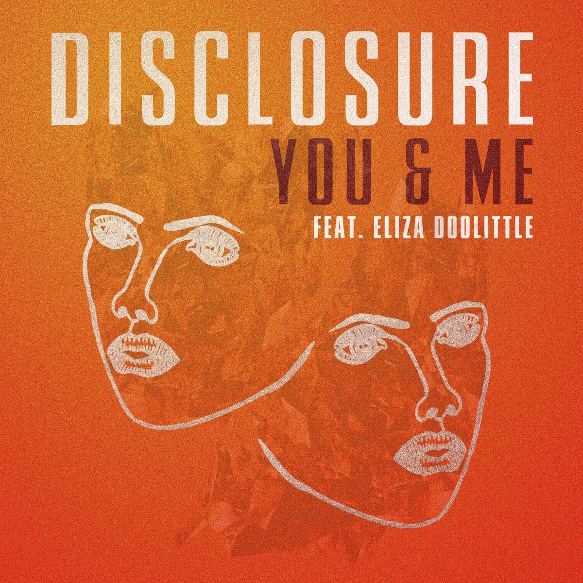
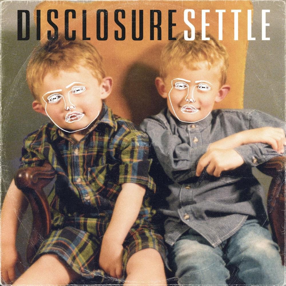
Imogen likes the hand-drawn illustrative face that appears throughout Disclosure albums, and thinks it's a great way of creating consistency in their branding. She particularly likes the way this has been done for their album Settle: ‘I like how the image of the two boys represent the brothers when they were younger, but their faces covered by older faces shows their identity later in life.

Kanye West - Graduation
Evie thinks Graduation by Kanye West shows a great use of illustration that helps to tell a story. ‘The background of the cover is vibrant, filled with colourful shapes and patterns helping to portray an energetic and striking feel’.
Evie also loves this simple but iconic album cover from the Arctic Monkeys.. ‘I think the design is super clever because it features both the letters "A" and "M" - connecting them with horizontal lines to create an abstract but sophisticated design’

Arctic Monkeys - AM
Megan likes the typography in Vanilla Gorrilas ‘Colour flow’ and how it matches with the psychedelic-like illustration style! She also thinks it’s clever how the ends of each word have been linked together as well as the vibrant colour palette.
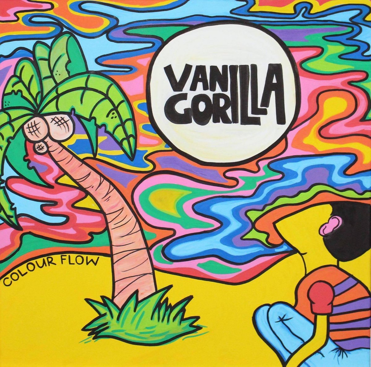
Vanilla Gorilla - Colour flow

The Weeknd - Starboy
Megan also loves the way the album cover for starboy uses bold typography and layering.. ‘I think the symmetry and contrasting colours of the design make it really visually striking’.