
Sweet deals, sour results: The truth about design shortcuts
Halloween is full of clever disguises, although in design, we see them all year round. Quick fixes can seem harmless at first, yet over time they drain energy, confuse audiences, and cost more to repair than doing it properly from the start.
At Launch Studio, we see these shortcuts appear in many forms, each claiming to make design simpler than it really is. The truth is that good design needs more than surface polish. It needs thought, consistency, and context. In the spirit of the season, here’s a look at some of the common design “treats” that quickly turn into tricks.

AI logos, sweet or scary?
AI-generated logos sound tempting. You type a few words, press a button, and out pops something that looks ready to go. It feels clever and instant, yet what you get is often more trick than treat, neat on the surface, hollow inside, just like a pumpkin.
A logo should reflect more than your company’s name. It needs to hold up across platforms, scale with your business, and connect emotionally with your audience. That is difficult to achieve when it has been created by an algorithm. What feels like a quick win often ends up being replaced faster than a seasonal special, and by then you have already spent more time and money fixing it than you saved to begin with.
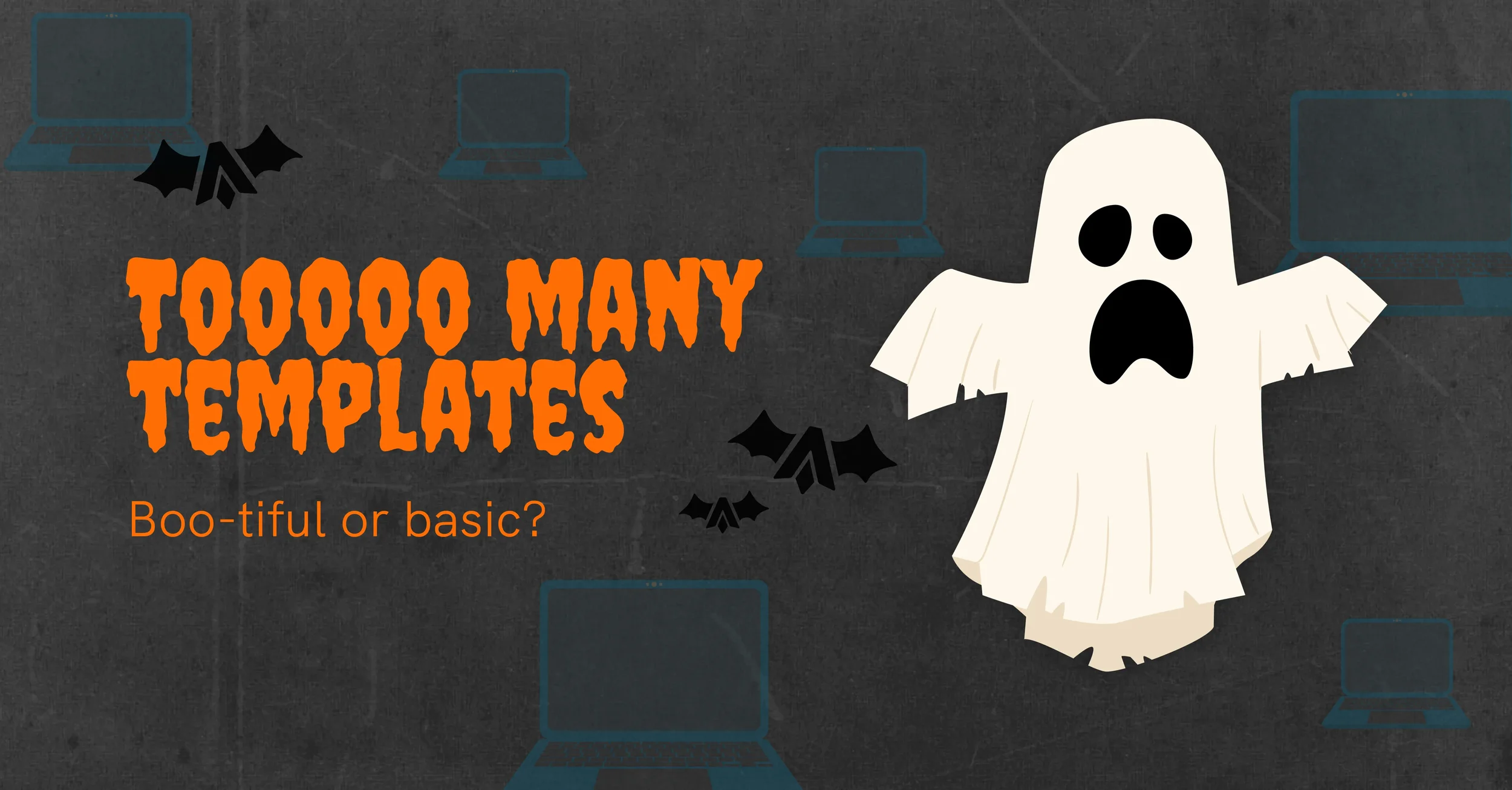
Templates, boo-tiful or basic?
Cloud platforms make design feel effortless. You log in, pick a layout, drop in your logo, and you’re done. It looks tidy, and for a moment you feel like a creative genius. The catch is that millions of other users are doing exactly the same thing. You could be a solicitor in Southdown using the same brochure as a SaaS company in Shanghai, or a private investment firm in Piccadilly with the same Instagram grid as Poppy’s Cupcakes Penzance. We even see agencies offering repurposed graphics like this as part of their “packages”. Frightful.
Templates have their place for structure and speed, although without real creative direction your message becomes one of many, to the point of invisibility, the kind our Ghost knows all too well.

DIY rebrands, bold or monstrous?
We admire enthusiasm, but the weekend rebrand rarely ends as planned. It often starts with excitement and a free design app, then slowly turns into a confused mix of fonts, colours, and mismatched messages. Before long, your audience is not sure who you are.
Branding or rebranding should be an exercise in clarity. Bringing in a team that can see the whole picture helps you avoid that stitched-together look of our friend Frankenstein. Two heads are better than one, and working with an agency means you are backed by a whole team of expert minds, not just your own. That kind of collective thinking is what keeps a brand from coming apart at the seams and is often the difference between getting lost and building a lasting identity.
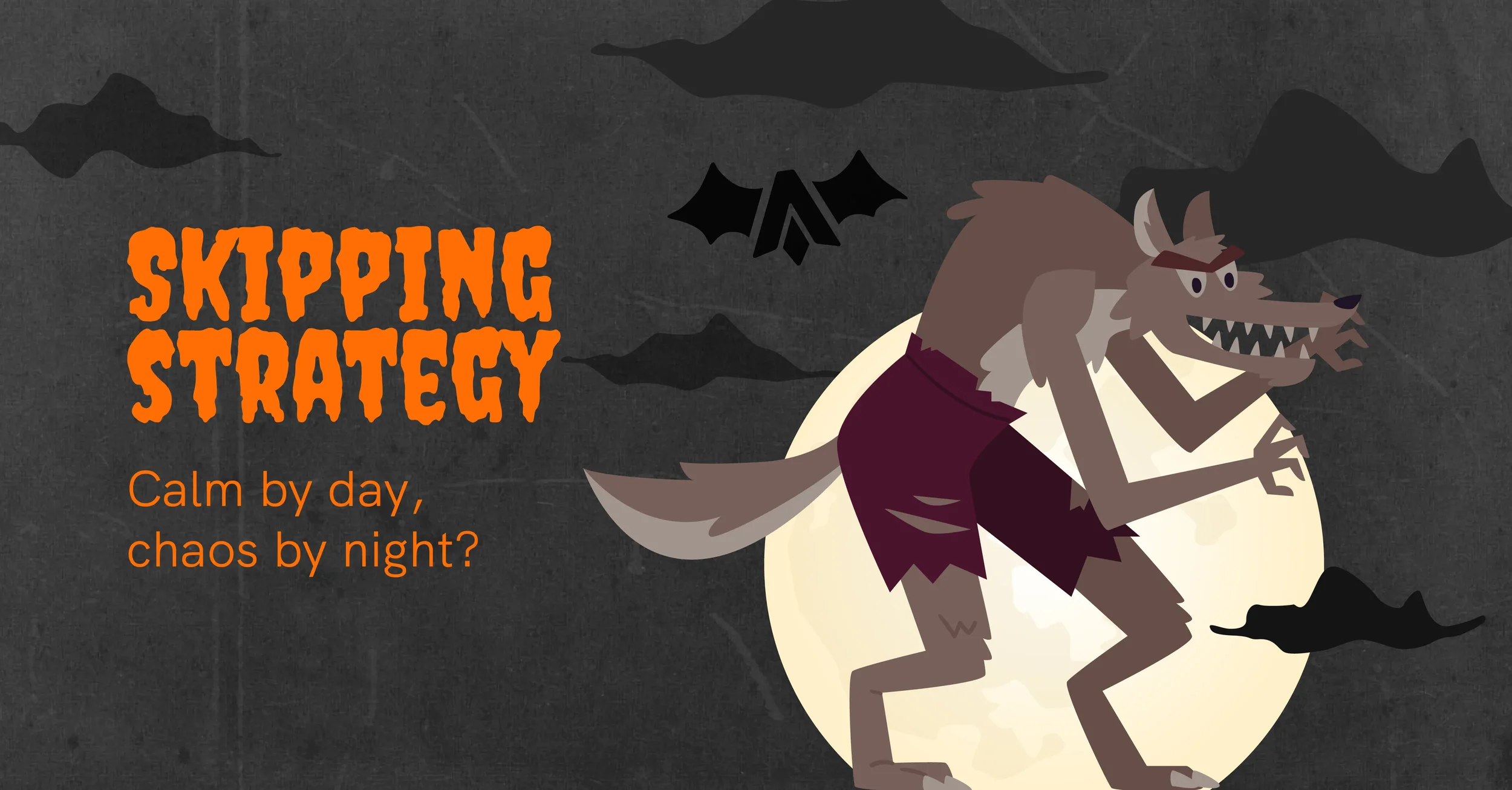
Skipping strategy, calm by day, chaos by night?
Skipping strategy can feel fine at first. You dive into design, things look rosy, and it all seems under control. Then everything shifts, small cracks appear, and before long your brand starts behaving differently from one moment to the next, calm by day, chaotic by night, a bit like our Werewolf.
Taking time to define what you stand for makes creative work more effective. When strategy leads design, every visual choice supports a clear purpose. It saves time later, reduces confusion, and keeps your audience engaged for all the right reasons. That level of perspective is hard to find alone, which is where an agency’s strategic support becomes invaluable. Our team will connect the dots between your goals, your audience, and your visual identity, keeping your brand consistent through change and growth, not outside howling at the moon.
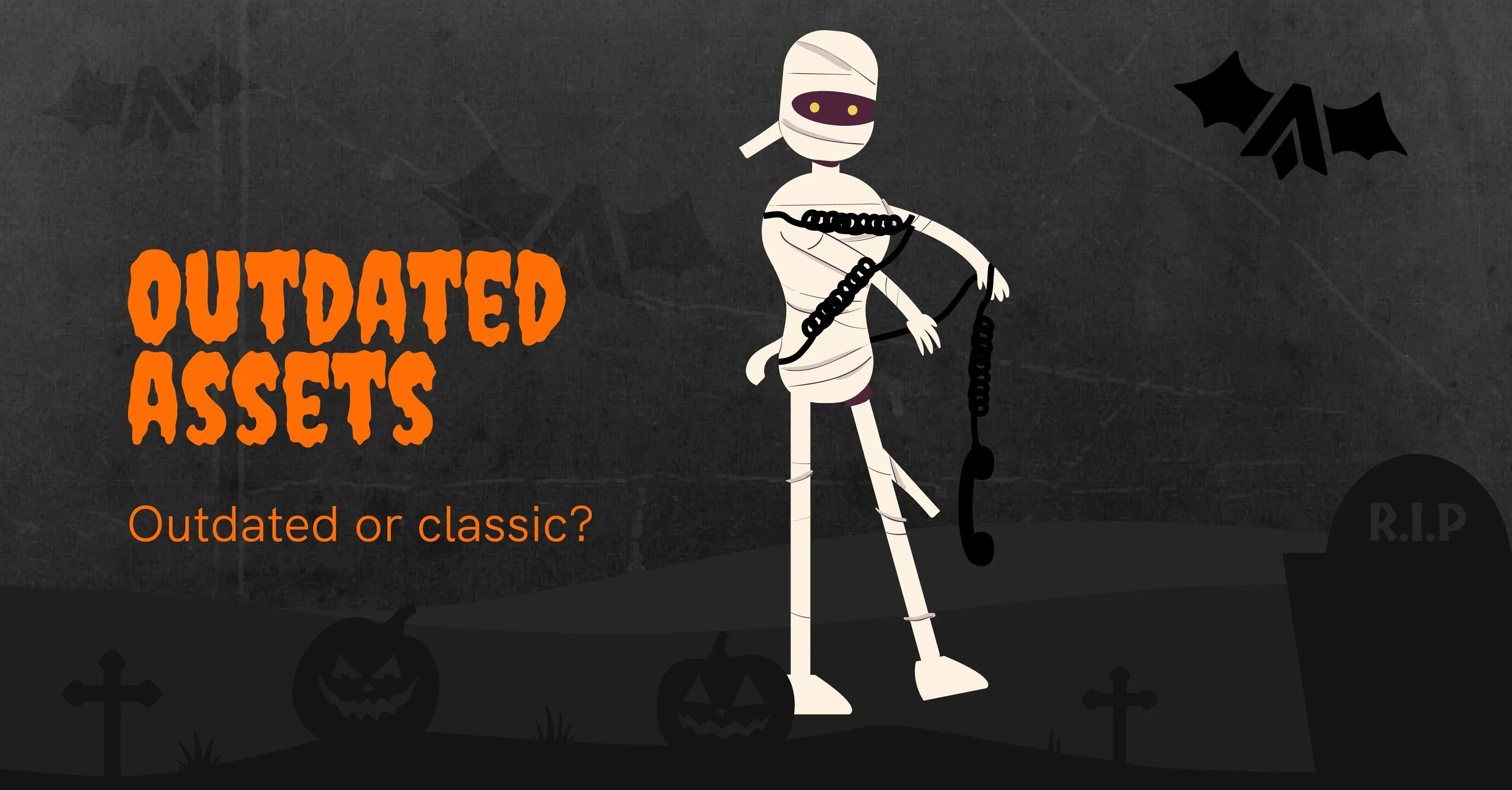
Outdated assets, classic or ancient?
There is a fine line between classic and dated. Holding onto design assets that “have always worked” can stop your brand from moving forward. Colours fade in relevance, typography styles change, and language evolves faster than we realise.
Refreshing your assets does not mean losing your roots. It proves that your business is still active and paying attention. A modern identity tells your audience that you are current, confident, and alive, not a relic like our Mummy.
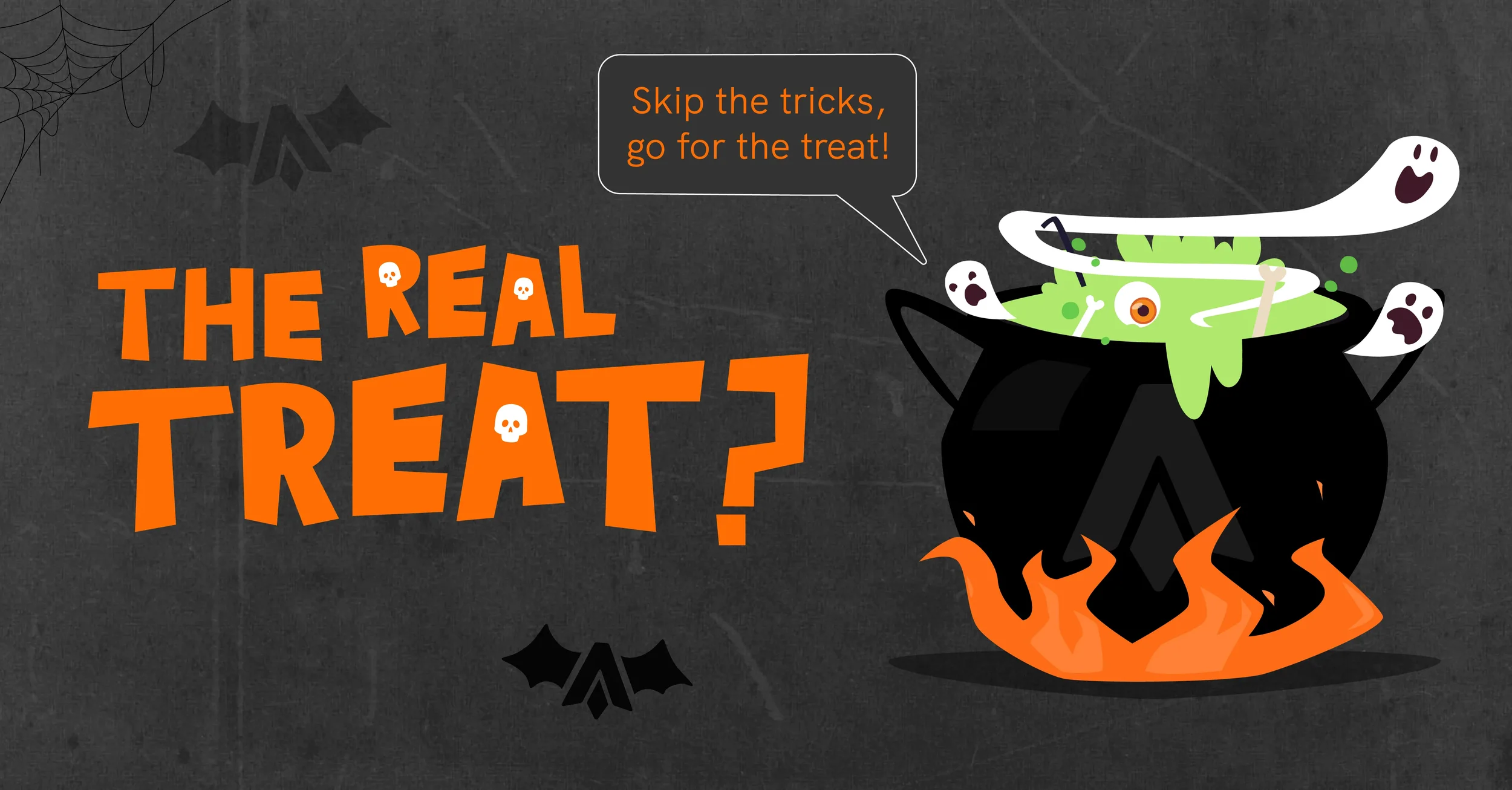
The real treat?
The real magic in design is doing it thoroughly. That means purpose before visuals, and strategy before shortcuts. That is why we exist, and why so many brands trust us to bring structure, focus, and imagination together in a way that makes sense for their business. There are no spells or potions for a strong brand, just the right mix of curiosity, clarity, and creative thinking.
When we work with clients, we always start with questions before visuals. What does your brand stand for? Who needs to believe in it? How can design help you get there? Those answers shape everything that follows and save you valuable time, energy, and money that would otherwise be spent fixing avoidable mistakes.
Work that truly connects is rarely off the shelf. It comes from understanding your business, your goals, and your audience, then turning that insight into something that feels made for you, not borrowed from someone else.
Shortcuts might look sweet, but real results come from thoughtful strategy, intelligent thinking, and consistent execution. Do not be the brand still haunted by last year’s look, or dragging its soul around the template graveyard, let Launch lift the curse of bad design and bring your business back from the dead.
Need more?
You can view our full range of services by exploring our website or get in touch to speak directly with our team.